Cameron Motameni
Case Study

Vitalacy Virtual Care Dashboard

Vitalacy Virtual Care Dashboard
Overview

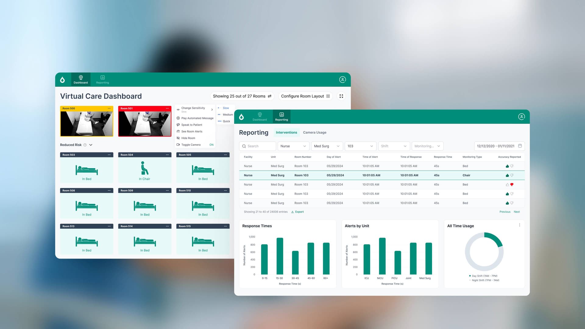
Hospital staffing shortages make it impossible for nurses to physically monitor every patient in real time. Vitalacy's machine-learning system detects fall risk through video analysis, but the nurses using it needed a fast, intuitive way to act on alerts and make care decisions without adding to their workload. Over 4 months, I designed a virtual care dashboard that put nurses in control—letting AI flag risks while keeping clinical judgment at the center.

vitalacy-large-cover-Chzf4Z1C.jpg
The Challenge
Competing Demands
Nurses juggle constant movement, short staffing, and the need to respond to real-time patient risks. The dashboard had to be glanceable, not demand constant attention, and enable soft interventions (like calming a patient via two-way video) without requiring staff to leave their station.

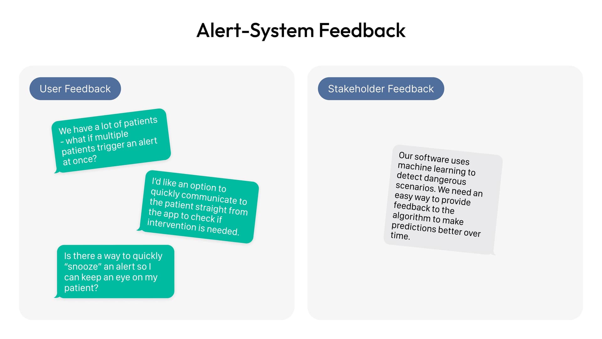
Research revealed four core design principles: the tool must be glanceable and not demand constant attention; AI flags risks but nurses always make the final clinical call; risk history and alerts should be contextually relevant without deep digging; and the system should enable soft care interventions through two-way video communication.

Research & Discovery
1
In-Depth Interviews
Conducted 12 interviews with nurses, charge nurses, and safety officers to understand workflows, pain points, and decision-making patterns.
2
Contextual Inquiries
Spent 3 sessions observing real behavior in active in-patient units to see how staff move, prioritize, and respond to alerts under pressure.
3
Stakeholder Alignment
Interviewed hospital leadership to identify high-priority data needs and refine reporting requirements for tracking safety trends.
4
Design Principles Definition
Synthesized findings into four guiding principles: glanceability, human-centered AI, contextual relevance, and soft intervention enablement.
User Priorities & Pain Points
Mapping high-priority and low-priority user needs from stakeholder interviews informed feature prioritization and reporting design.

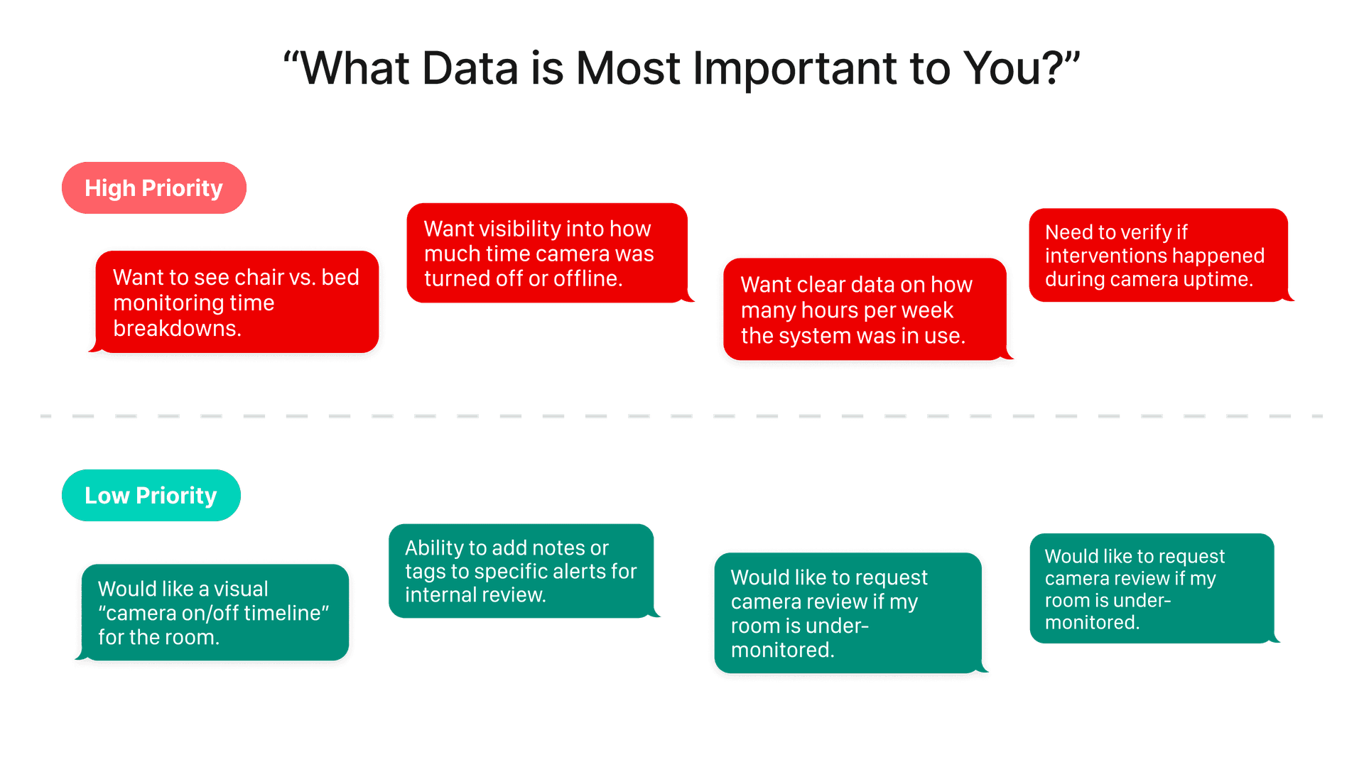
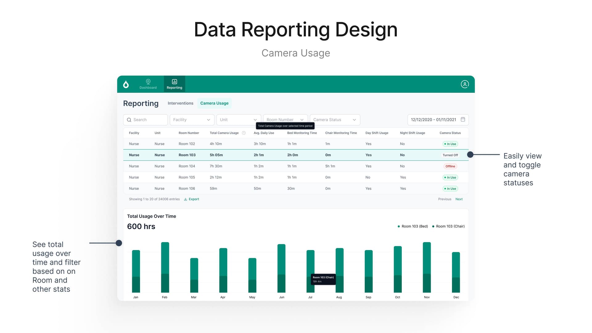
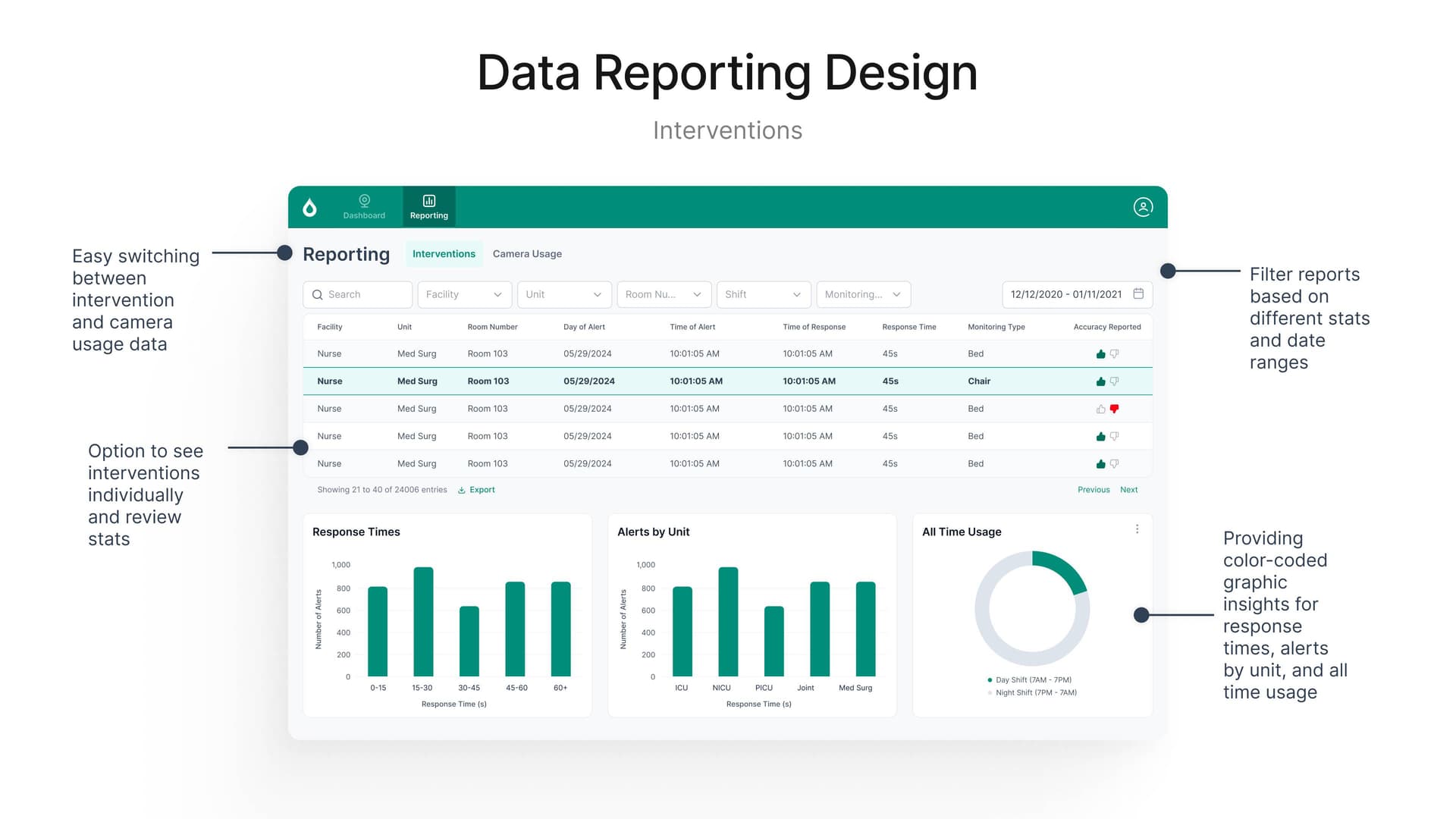
High-priority needs included monitoring chair vs. bed time breakdowns, tracking camera offline/downtime, and ensuring interventions happen during camera uptime. Lower-priority requests—like timeline visualizations and alert tagging—were deferred to later iterations while core safety features took precedence.

Design Approach

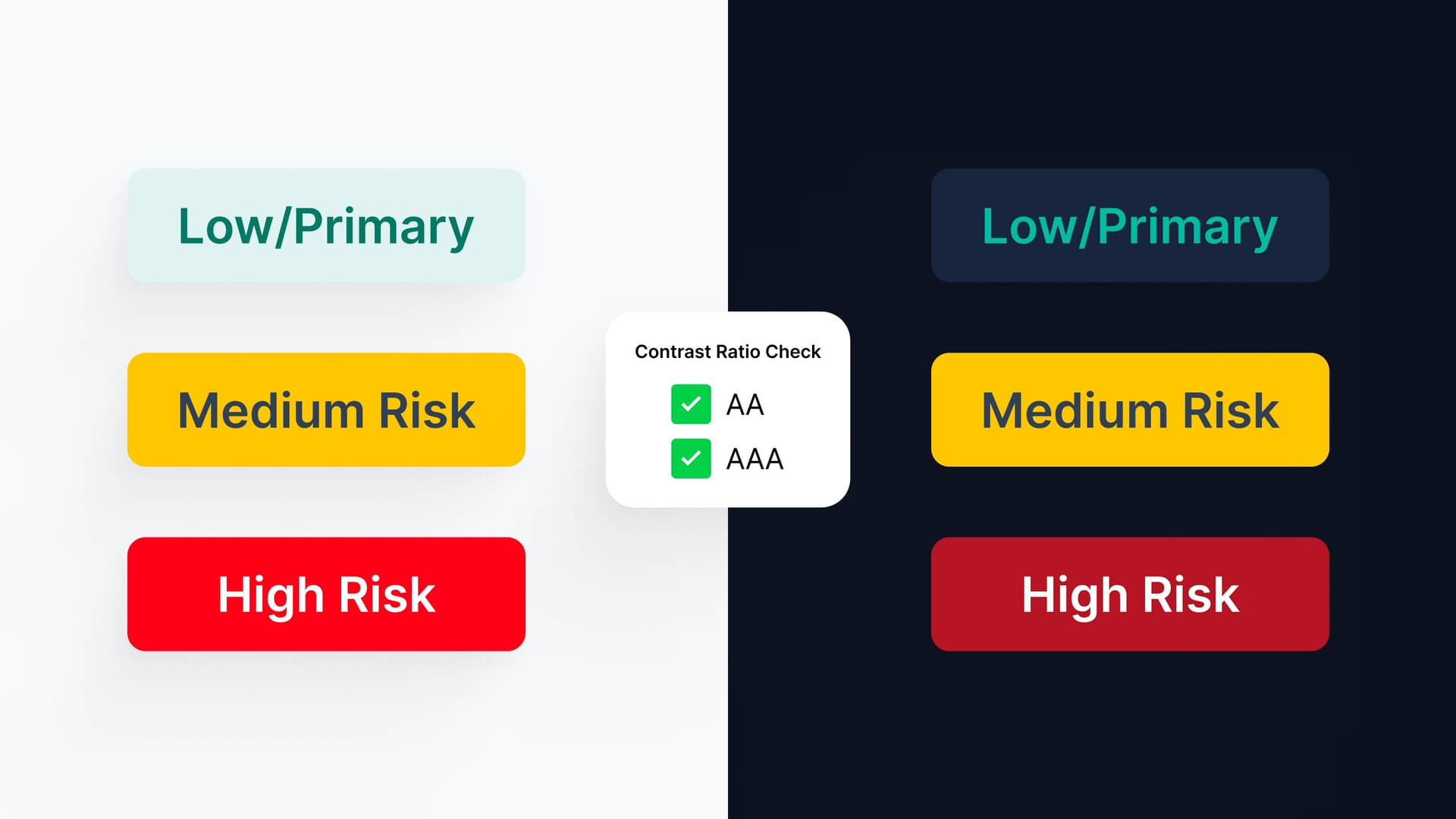
I started with sketches and low-fidelity wireframes exploring layouts that visually prioritize patients by risk. Color coding emerged as the primary way to signal risk levels instantly. Wireframes were reviewed with the full product team—product owner, graphic designer, marketing, and developers—before moving to final design to ensure alignment on feasibility and impact.

Contrast ratio checks ensuring AA and AAA compliance across light and dark modes to support accessibility guidelines.
Key Features

The dashboard balances simplicity with clinical depth, giving nurses the right information at the right time without overwhelming their already demanding workflow.

Responsive Patient Cards
Adapt dynamically to the number of patients and their states, with pagination for large wards. High-risk patients are always visually elevated and placed at the top for immediate attention.
Real-Time Risk Alerts
Designed for immediate attention with clear confirm/dismiss actions. Handles multiple simultaneous alerts without overwhelming staff, with smart scrolling to show all at-risk rooms.
Two-Way Video & Soft Interventions
Nurses can interact directly with patients through video without leaving their station, enabling calming conversations and de-escalation in real time.
Accessibility & Contrast
Supports light and dark modes with high contrast color coding. Patient position states are instantly recognizable, and color is reinforced by informational chips and icons to avoid reliance on color alone.
Reporting dashboard for Camera Usage lets staff view trends over time, filter by facility and unit, and track system uptime and availability.
Interventions reporting dashboard enables easy switching between data views and filtering by multiple dimensions to track response times and alert accuracy.
Alert & Feedback Refinement

User and stakeholder feedback shaped alert design. Nurses asked for quick communication and snooze options; stakeholders needed feedback mechanisms to improve the ML model over time.
Dashboard Interactions
Large room alert modal appears when a patient is flagged at high risk, with quick actions to dismiss or flag for review.
Patient cards adapt based on risk state. Low-risk cards hide visual noise by default; hover states reveal video controls and communication options for all risk levels.

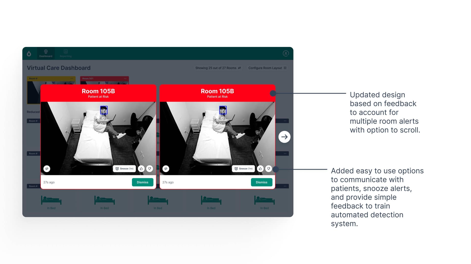
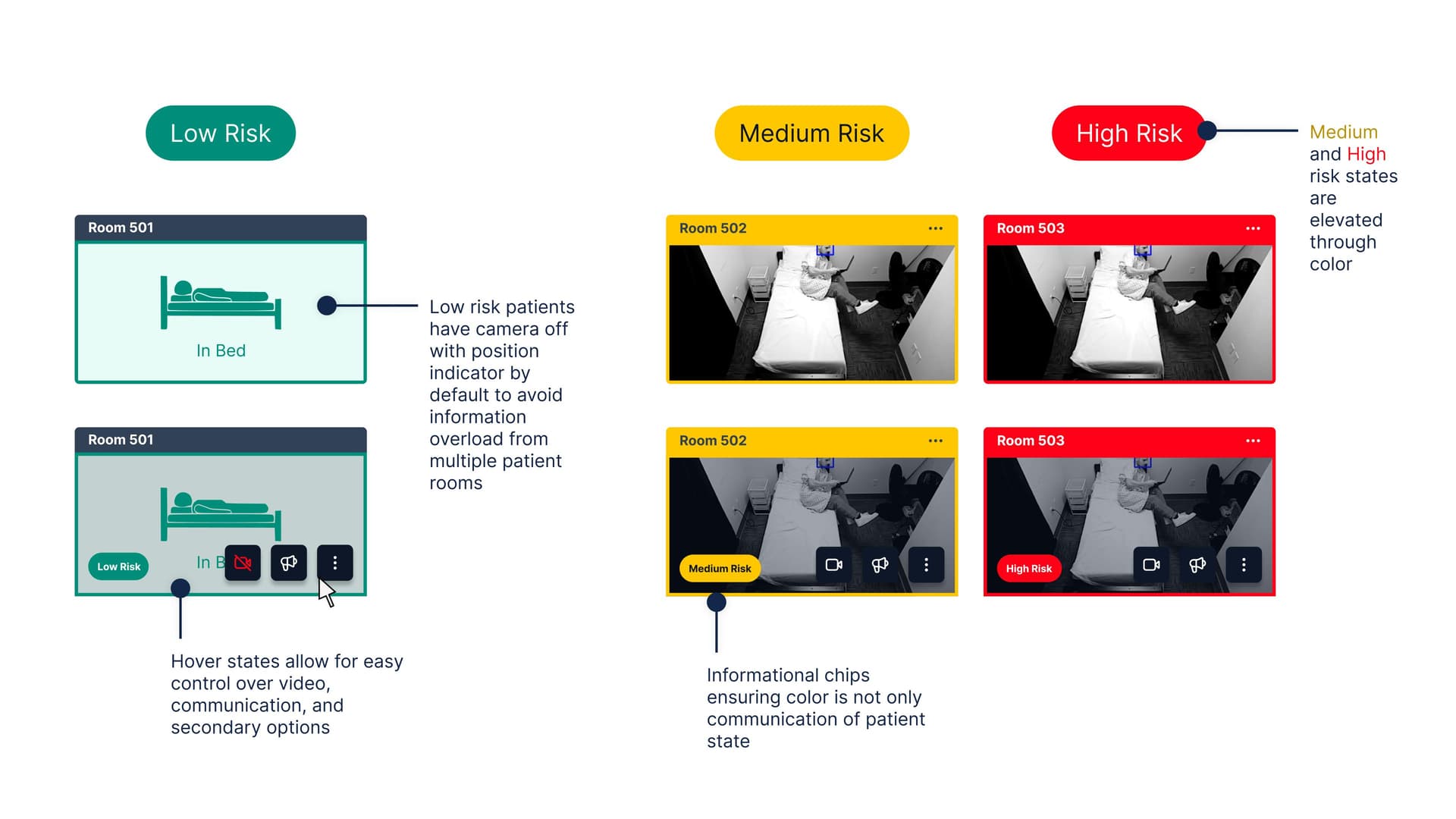
Hover interactions let staff toggle video for privacy, interact directly with patients, or snooze alerts without leaving the dashboard. Low-risk patients have camera-off by default to reduce information overload; higher-risk states are visually elevated through color and position, with informational chips reinforcing the risk level beyond color alone.

Results & Impact
0%
Increase in nurse-reported situational awareness
0%
Increase in staff engagement with virtual monitoring
0 hospitals
Adopted in first rollout
Key Takeaways
Glanceability Over Completeness
Hospital staff have limited attention. Hiding secondary information by default and revealing it on demand kept the interface uncluttered while maintaining power-user capabilities.
AI Augments, Humans Decide
Nurses consistently told us they trust their judgment. Designing for human override and feedback loops—not automation—built trust and improved the model over time.
Color + Redundancy = Accessibility
Color-coded risk states are fast, but high-contrast color alone is insufficient. Pairing color with icons, position, and informational chips ensured the design worked for all users.
Contextual Reporting Matters
Stakeholders needed to track trends and improve safety. Reporting dashboards organized by priority let hospital leadership act on insights without overwhelming nurses with data.

Next Project

BuildWise: Centralizing Construction Knowledge

View project